Rentiers Platform Redesign
Our Goal
To simplify the investment journey and boost conversion rates through a minimalist, user-centric design.
Deconstructing the Friction
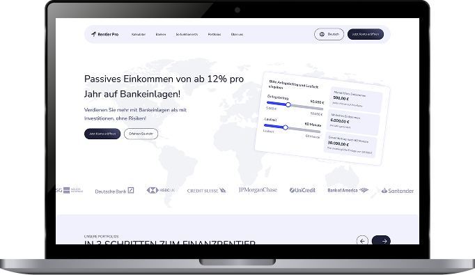
Visual Noise & Overload
Excessive high-contrast colors and fragmented elements created a chaotic experience.
Lack of White Space
Dense information blocks led to high cognitive load and user fatigue.
Poor Information Hierarchy
Vital financial metrics were overshadowed by secondary elements, hindering scannability.
Inconsistent Branding
Disjointed colors and outdated icons failed to convey modern FinTech trust.
Friction in Navigation
Unstructured text in legal and FAQ sections blocked quick information retrieval.
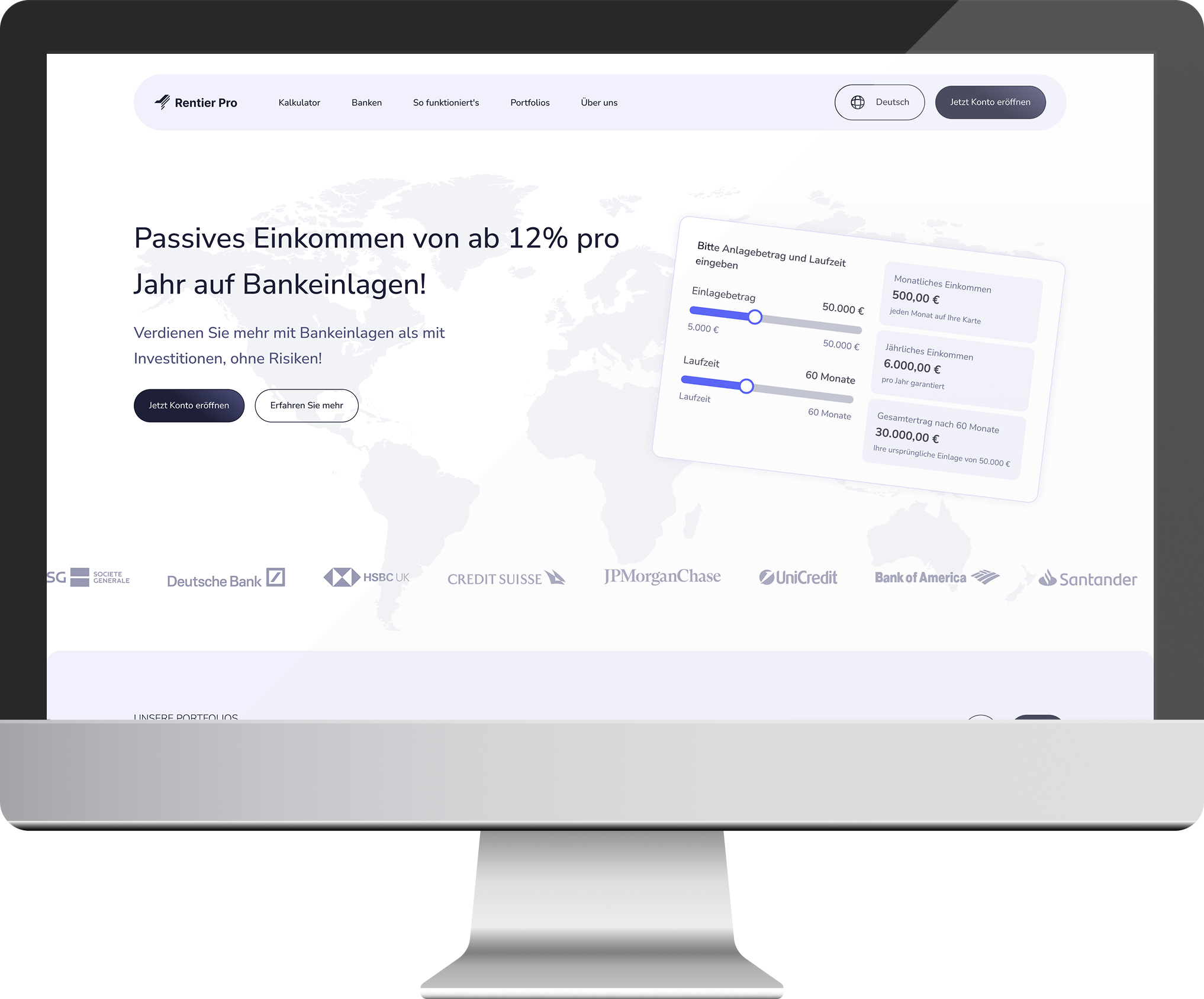
The Strategic Pivot: Designing for Trust
From Friction to Seamless Experience
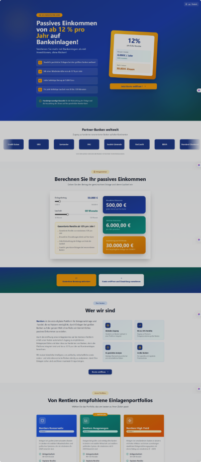
Minimized Cognitive Load
Cleaned the layout using a grid system and ample white space to reduce user fatigue and improve engagement.
Refined Visual Hierarchy
Applied a typographic scale to make primary financial data instantly scannable, following our UX/UI design methodology.
Intentional Color Strategy
Used a purple palette to blend modern FinTech style with trust and security, establishing brand credibility.
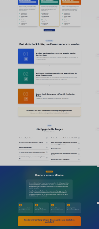
Intuitive Product Discovery
Used soft shadows and clear information architecture to streamline portfolio investment data navigation.
Structured Content Clarity
Streamlined legal docs and FAQs with accordions to build user trust and improve accessibility.
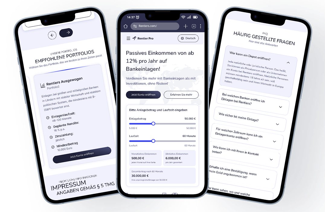
Responsive Simplicity: The Landing Page on Mobile
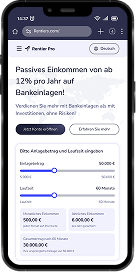
Mobile-Optimized Hero
Reorganized the hero layout to keep the value proposition and 'Profit Calculator' as the primary focus, ensuring mobile users immediately understand the investment platform's core offering.
Touch-Friendly Product Cards
Transformed product displays into a swipeable carousel for effortless thumb-navigation, improving mobile conversion rates for passive income portfolios.
Streamlined Content Flow
Refined vertical scrolling for 'About Us' and 'FAQ' sections to maintain clarity without overwhelming the user, following mobile-first design principles.
Final Results: Elevating the Standard
Improved Scannability
By decluttering the interface, we reduced the time to understand the core value from 15s to under 5s.
Institutional Trust
A premium purple palette and monochrome partner logos transformed the brand into a top-tier financial institution.
Seamless Responsiveness
Achieved 100% functional parity across all devices, ensuring a unified and consistent brand experience.
Explore more case studies
See how we've helped other teams transform their products.